Everyone who is anyone came out over the weekend in an attempt to calm fears of a further market meltdown.
With the Dow sliding +3,000 points in a single week, investors needed some assurance that the bottom wasn’t falling out.
As traders, we know better. Stocks can overshoot in either direction.
Instead, we focus on what we can control. When stock prices run up every day for two months, a day of reckoning will come.
That’s why I like to read charts and follow the flow of money.
I was prepared with my SPY puts on Friday that paid off nicely come Monday morning.
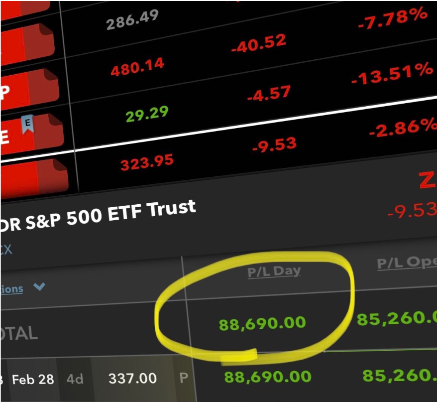
And that was just to start the week!
Friday’s market signaled a possible reversal of fortune from this steep decline. There are a few places you need to watch for clues, which I point out to you in this week’s intermarket analysis report.
So, strap in as we take a tour of the sectors that forecast our fortunes, starting with the VIX.
Let the VIX be your guiding star
During the Great Recession, markets regularly dropped hundreds of points over the course of a year and a half. Even at its worst, we would still see markets pop back with sharp rallies.
Thus the old saying – nothing goes in a straight line.
Seven consecutive down days in the market is a lot, even when you look over the entire history of the market. No one would be nearly as panicked if it took two weeks to cover the same amount of distance.
What I found interesting was the length of time it took for the VIX to get to extreme levels. In the last 10 years, the VIX has only been at $50 or over twice. It took until the end of last week to finally reach that level (close enough for me at least).
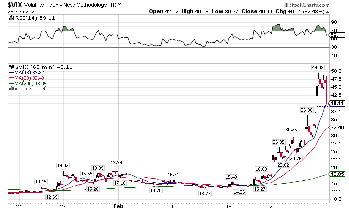
VIX Hourly Chart
The sharp reversal in the VIX on Friday tells me that we should get a bounce in the coming days. Additionally, the VVIX climbed over $120 – a key level that typically signals the end of a move.
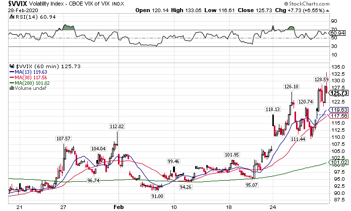
VVIX Hourly Chart
Both of these say that we’re due for a bounce. That doesn’t mean the declines are over by any stretch. Rather, we’re done with this latest move.
Important SPY Levels
Now the question is where does the market run into resistance. For that, we look at the hourly chart of the SPY. We want to see where the market failed at various points over the last week.
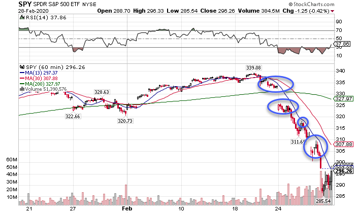
SPY Hourly Chart
I highlighted key points of consolidation and swings where the market tried and failed to hold up. These areas come in at:
- $305-$307.50
- $310
- $315 – $317.50
- $325
The market certainly doesn’t have to abide by these areas. But, they should act as resistance at least intraday.
Pro Tip: Try the same thing on your charts. Mark areas where you think the market should stop and see if you’re right. Use alerts to tell you when price gets there. It’s a great way to train yourself to find support & resistance.
Two Oddballs
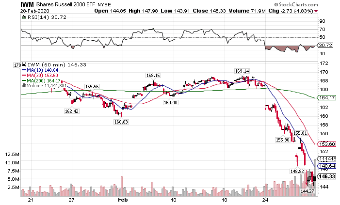
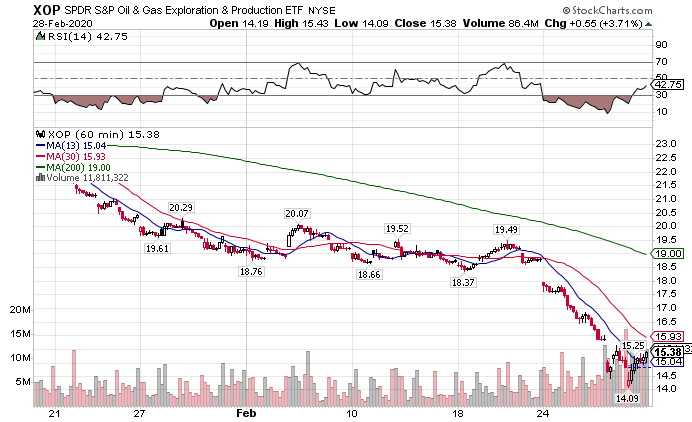
While everything took a faceplant, two sectors stood out from the rest – small caps and energy drillers.
Small caps, as measured by the IWM ETF, didn’t experience near the declines the SPY or QQQ did. In large part, they lagged the market on its meteoric rise, so they didn’t have as far to fall.
IWM Hourly Chart
If we see the IWM rallying to the same magnitude as the other markets, that would be a sign of a potential long-term reversal. Otherwise, any relative outperformance would just shrink the gap created over the past year.
Now, here’s the real weird duck for you. Oil and natural gas weren’t on any sort of a tear. They flopped with the rest of the markets. So, why did the drillers finish up almost 4% on Friday?
XOP Hourly Chart
This one was a real head-scratcher. Drillers underperformed for most of recent memory. I can’t recall the last time they showed any type of strength. That’s what makes this move so odd.
Keep an eye on this one. These names could be ready to run further than the rest of the market. If that’s the case, there could be a lot of juicy trades in this sector.
Beware of the bond bubble
Prior to the decline, equities were frothy, but not in a bubble. On the other hand, bonds could be getting to that point.
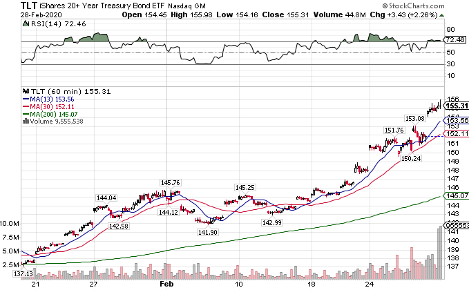
We’ve seen treasuries and government debt rally around the world as investors flew to safe havens. That led to a stunning rise in the TLT last week.
TLT Hourly Chart
Here’s where I see a potential problem. If the Fed pumps more money into an already rising bond market, we could see the TLT run up just like equities and then pop.
That’s why I plan to keep an eye on the TLT for signs of it running away. In the interim, I’ll use setups to find long plays when premiums get a little cheaper.
Want my next big trade idea?
