If you thought the market’s reaction to the weekend news was positive, I’d also like to add an observation I’ve been witnessing.
There is a specific trend I’ve noticed over the last week. And all has to do with the market’s fear index, the VIX.
It rises during periods of uncertainty and market sell-offs. And declines during bull markets and slow moving-markets.
Take a look at the chart below:
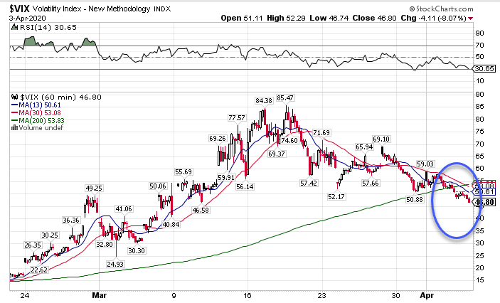
VIX Hourly Chart
And since you’re well-versed in what I covered in class, you know exactly what that circle represents.
If you don’t, no worries.
I’ll review it here, and explain it to anyone who hasn’t gone through the class.
We’ll be looking at fresh charts on the VIX, TLT, and IWM…aka the big picture
Betwixt The VIX
The VIX measures the implied volatility of options on the S&P 500. Think of implied volatility as the demand for options. Demand tends to increase as markets fall and visa versa. So, what does this chart tell us?

VIX Hourly Chart
That circle tells us three critical pieces of information. First, the VIX closed at the dead lows of the week, and it didn’t just get there on the last day. The VIX spent the entire week in a slow bleed lower.
Second, we’re trading below the 200-period moving average on the hourly chart. That’s a crucial point as that typically acts as support. Yet, the VIX didn’t even bother holding there. It strutted past it like a jilted lover.
Third, the 13-period moving average continues to ride below the 30-period moving average. When you get a faster moving average holding below a slower one, it highlights an ongoing downtrend.
I want to let you in on a little secret.
We’ve got the exact same phenomenon happening in the VVIX, which measures option demand on the VIX.
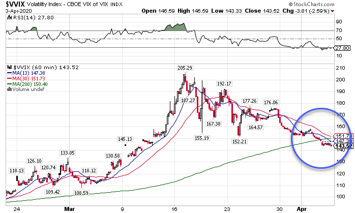
VVIX Hourly Chart
Lower implied volatility on the VIX often means that stocks want to move higher. When both the VIX and VVIX echo the same story, it’s likely we’ll see a rally.
A Crude Story
Last week’s rally started in part from the crude markets. That shouldn’t surprise most of us as the plunge in crude last month kicked off the second, steeper leg of the decline in equities.
Supposedly, Trump managed to bring the Russians and Saudis to the negotiating table. Both turned on the oil faucet, creating a glut of supply against declining global demand. However, Monday’s meeting has been postponed after some jawboning by both sides.
Nonetheless, we’ve seen one of the most historic dives in oil prices. We shouldn’t be surprised to see rallies that leave skid marks.
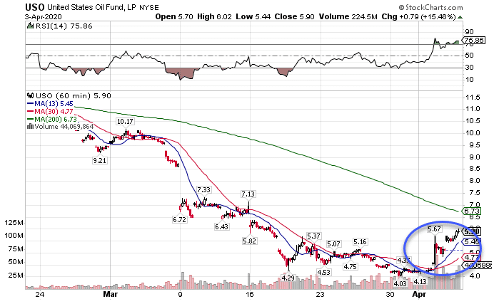
USO Hourly Chart
While we haven’t quite crested the 200-period moving average, we’ve got a 13-period crossing over the 30-period moving average. This ‘money-pattern’ tells me oil wants to at least hit the 200-period moving average. Plus, we’ve got a pretty bullish setup there as well.
Things Still Suck Long-Term
Make no mistake…any short-term rally is meant to cause shorts a lot of pain. However, the bond market says we can’t get complacent.
Money continues to flow into treasuries, hoping to hide out from stocks. You can’t look at this chart and see anything but the bond bulls in the chart.
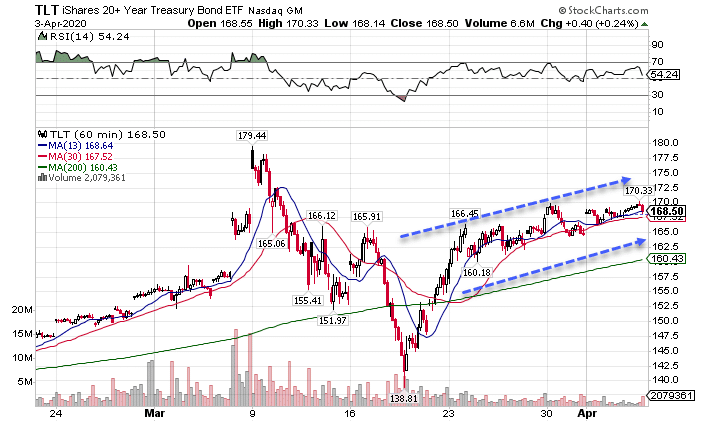
TLT Hourly Chart
Yes, it will be difficult for bonds to make new all-time highs. Heck, they’ve experienced their own record rallies. If we went much further, we’d see negative rates in the U.S. pretty soon.
Small Caps – Big Drops
Two areas continue to get butchered: small caps and financials. Most people aren’t aware, but the Russell 2000 small-cap index has a heavier weighting of financial companies than the S&P 500. It’s also more susceptible to economic risk as smaller companies have shallower balance sheets than the big guys.
When I look at the IWM hourly chart, I can’t help but wonder when it’ll fall apart.
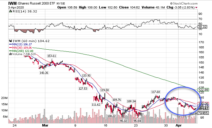
IWM Hourly Chart
Not only does the chart have a bearish crossover, but it continues to far underperform the other major indexes. The SPY finished down 2.06% last week. That’s Warren Buffet compared to the IWM’s -7.05%.
From the all-time highs, the IWM is down 38.66% compared to the SPY at -26.8%. Small caps tend to lead the rest of the market which tells me the bears are far from done ripping things apart.
Did You Miss The Masterclass?
Not to worry. I’ve got another one coming up shortly, so while you’re trapped indoors, do yourself a favor and get a free education.
