Many traders woke up this morning in utter dismay when they saw the DOW futures trade down by more than 740 points. The fear of coronavirus cutting into corporate revenues across the globe is now becoming a reality.
Companies like Apple, FedEx, and Starbucks have revised earnings lower because of the coronavirus pandemic.
When stocks experience a sell-off of this magnitude, it’s important for you to know which are the key levels of support and resistance.
And while the charts below were put together last night, the analysis I’m about to share with you—still rings true.
The higher they climb the harder they fall. Technology-led the bulls last year. So it’s no surprise the QQQ crashed out harder than the other indices last week.
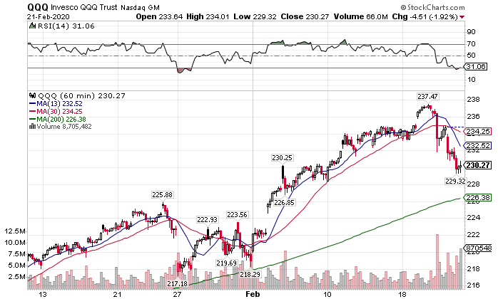 QQQ Hourly Chart
When I step back and take an expansive view of the market, I don’t think the pain is over. Financials flashed warning signs long before Friday. Gold and bonds clearly said there were issues.
Rather than focus on what we already know, this week’s Intermarket analysis looks at what sectors will provide us the answers we need. Relying on the wrong charts for your forecasts could wipe out all your gains.
Everyone is focusing on the headline-grabbing markets – the S&P 500, the Dow, the Nasdaq 100. That’s all fine and well. Most investors have money tied up with them in some way or another. But those only tell you where you are, not where you’re going.
For that, we need to dive into the tech wreck.
The tech wreck
I can’t say for certain what it was that woke up investors to the real dangers in tech valuations. But it appears they all got the message at once. Semiconductors became the first casualties.
With the Coronavirus hitting supply chains as well as Chinese economic growth, semiconductors held on as long as they could. Last week investors decided that between the Apple announcement of a revenue miss and an increase in infections, it was time to pull back.
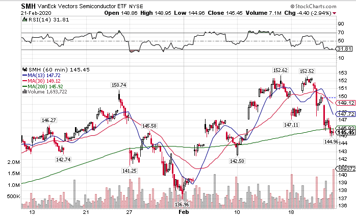 SMH Hourly Chart
I’m actually amazed this area held up as long as it did. Semiconductors are notorious for boom and bust cycles. The one-time innovation matured into a commoditized space. With so much of the supply chain flowing through China, this index should have fallen weeks ago.
In fact, I think this area holds more risk than most other sectors in the coming months. Don’t be surprised to see violent swings in names like AMD or INTC.
Substantial outperformance from the little guys
If you wanted to make money in 2019, you dropped cash into the major indices. Small caps lagged for the majority of the year, only breaking out of their range on the final end-of-year ramp. That put indexes like the QQQs in unsustainable territory.
Normally, small caps outperform during booming economic cycles, powered by global expansion. Their diverse customer base relies on revenue growth to push prices higher. Our current rise has been marked by bottom line improvements driven by cheap money. Business lending remains tight for smaller companies.
So why would the IWM only be down 0.77% compared to 2.83% for the QQQ and 1.44% for the SPY?
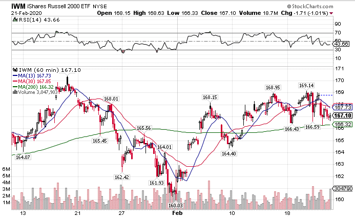 IWM Hourly Charts
It comes down to risky money. Last year, money took risk by flooding into the QQQs, driving it up 42.10% compared to 21.06% for the IWM. Normally, money that seeks risk spreads out more evenly. Even the high yield debt market (HYG) didn’t make it up double digits last year.
This leads to two conclusions. First, there isn’t as much money to flow out of small caps as tech. Second, from a relative value standpoint, if risky money needs to find a new home, small caps make the most sense. No one wants to dump risk money into the debt market when yields are this low. They want to get more for their investments.
So, if we see the small caps start to crack along with the rest of the market, that is a signal things are about to get very bad.
Safety trades not all in sync
Most of us are aware of the outperformance of bonds and gold last week. Gold certainly took the prize, breaking out past old highs and starting another leg of its bull market. Bonds didn’t come out as strong, but still managed to break through their recent highs.
Yet, the oddball out there was the US Dollar. Normally, money hides in the US Dollar for safety when stocks sell off. This doesn’t always happen since higher bond prices can lead to a lower dollar. However, it’s decline last week was notable.
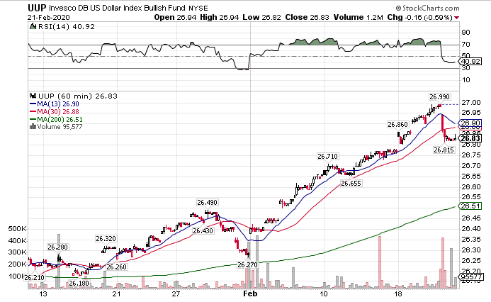 UUP Hourly Chart
This could just be a pullback before the dollar index reaches $100 (par value) on a basket of currencies. However, this could also be the first warning sign the Fed is losing control.
Yes, the central bank wants to weaken the US dollar. However, all they’ve managed to do is make bonds more expensive. With treasuries getting more overvalued by the day, we could be setting up for a crash in bonds. This could spike yields and the dollar at the same time.
Gradual moves don’t always hurt the market. Fierce swings in a short period of time can create a cascade failure across markets.
The VIX and VVIX will tell you everything
Equities and the VIX have an inverse relationship. When equities rise, the VIX tends to fall. If you see the VIX rising, it usually means equities are heading lower. The VVIX measures option demand on the VIX.
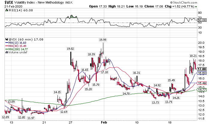 VIX Hourly Chart
Right now both are up a good amount compared to last year. The main levels we need to pay attention to are $20 in the VIX and $115 in the VVIX. Once we start to get to those areas, we should start looking for a bottom.
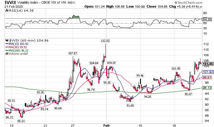 VVIX Hourly Chart
That doesn’t mean that we can’t bottom before then. Look for an intraday reversal on the VVIX with confirmation on the VIX to tell you when things are changing.
The best trade for next week
Every Monday I release my highest conviction trade idea aimed at hitting 100%. There’s still time to get yours before the market opens Monday morning.
