90 days ago economists were warning us about a possible recession. Fast-forward to the present, and nearly every analyst on the Street is taking credit for this latest bull run in equities.
One look beyond the S&P 500, and you quickly realize that not every equity will end this year on equal footing.
Fundamental analysis hasn’t worked in over a decade. With already stretched valuations, you need to pick the right stock and sector if you want to navigate this market successfully.
That’s why this week’s Intermarket analysis focuses on the sectors and areas poised to outperform— before that last Amazon package hits your doorstep (that no one remembers ordering.)
The easiest trade on the board –VIX
If it was possible, I’d mainline the VIX. Since you can’t, I prefer call options. I’m a volatility junkie at the end of the day.
With the VIX heading towards egregious lows, you get a high probability trade served belly up.
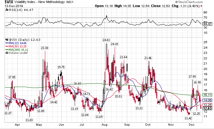
VIX daily chart
The trade is super simple…I watch the VVIX for a signal…buy in-the-money call options on the VIX…pick up 10%-20% and call it a day. It’s really that easy.
But then again, maybe I just make it look that way…
Underperforming Sectors – Industrials & Transports
While the feckless trade deal helps agriculture, it doesn’t have a lot of Christmas joy for the U.S. manufacturing sector. Consumer expenditures kept the economy out of recession but haven’t flowed into the local industry.
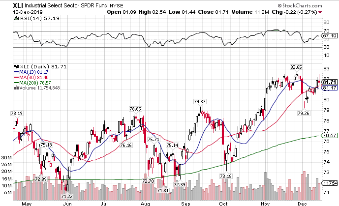
XLI daily chart
Unless the XLI makes its way above the previous swing high at $82.65, those stocks will continue to underperform.
Transports look even uglier. They topped out in August and keep making a series of lower highs.
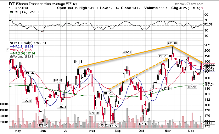
IYT daily chart
FedEx (FDX) earnings come up this week. Unless they smash expectations, the upper trendline that connects the lower highs will keep holding transports back.
Outperforming Sectors – Small Caps & Consumer Staples
Small caps are my favorite bull market play not just through the end of this year, but into the next. That’s a bold statement…and one I intend to back up with my Total Alpha trades.
They underperformed the broader market all year until they broke out of their recent range.
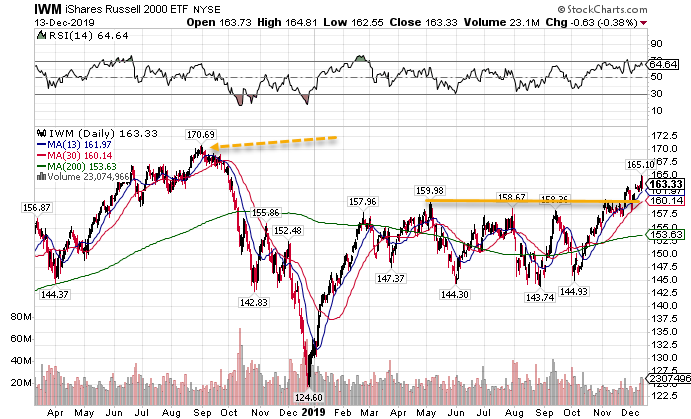
IWM daily chart
Money will start flowing into small caps as funds try to dress up their year-end performance. With over 4% until it hits the all-time high, this could easily happen within weeks.
Consumer staples… I mean just look at this beautiful trend. How can you not love this sector through year end?
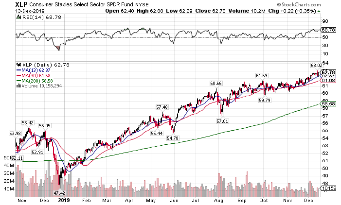
XLP daily chart
They may not blast off anytime soon, but they won’t fall apart before the holidays.
Hidden Gems – European Markets
After years of arguing, voters finally delivered Boris Johnson the seats necessary to leave the E.U. That clears the deck for the largest drag on all the European markets.
ETFs for countries like Germany finished last week exceptionally well. If the global economy is reflating, you can bet the German Indices will have a guten time.
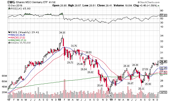
Germany Stock Market ETF weekly chart
The safety trade exit
Gold continues to lose its shine as more investors keep it trapped in bearish patterns. However, I spy with my little eye a curious little fly on the weekly chart.
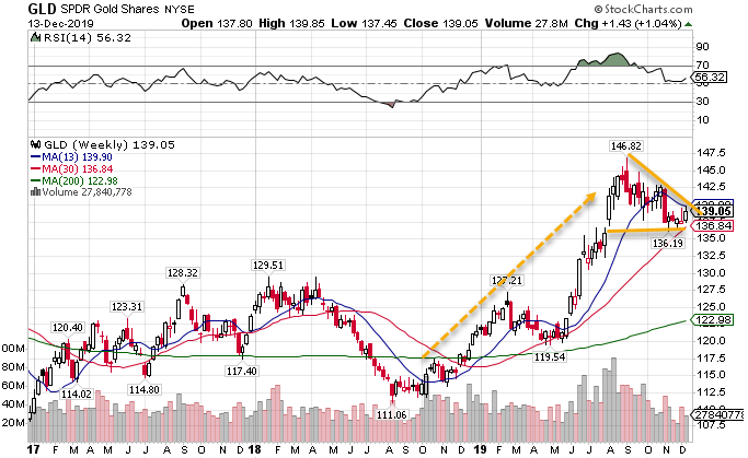
GLD weekly chart
This setup is a fantastic formation that Nathan Bear talks about all the time in Weekly Money Multiplier. These patterns like to play out to the upside rather than collapse. However, the weekly chart can take a long time to play out.
Bonds show the exact same TPS setup Nathan talks about.
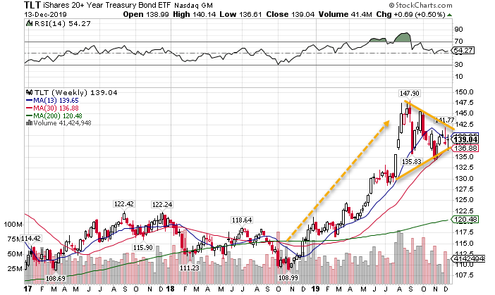
TLT weekly chart
You won’t see these fire off to the upside anytime soon. But these could make great long-term setups.
Dollar decline
I still don’t have a pulse on the weakness in the U.S. dollar. We didn’t get anything new from the Fed, and all the data points to a strong U.S. economy. That should push the dollar higher, not lower.
But then again, it’s been a topsy-turvey world these days. Normal correlations don’t seem to matter anymore.
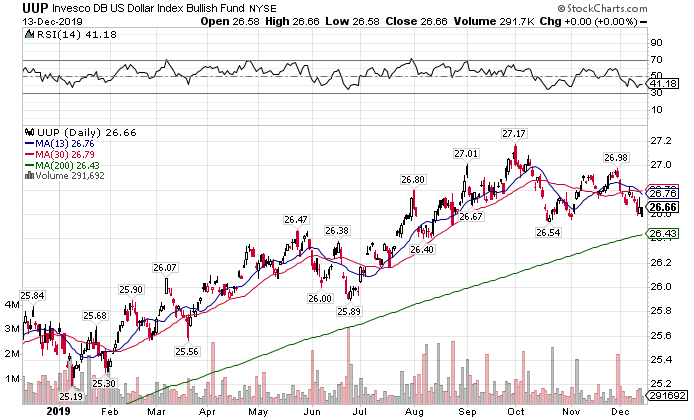
UUP daily chart
The most dangerous bubble out there – high yield corporate debt
After years of easy money, central banks created zombie companies that survive on cheap debt. You want to see excess then take a look at the high yield corporate debt chart.
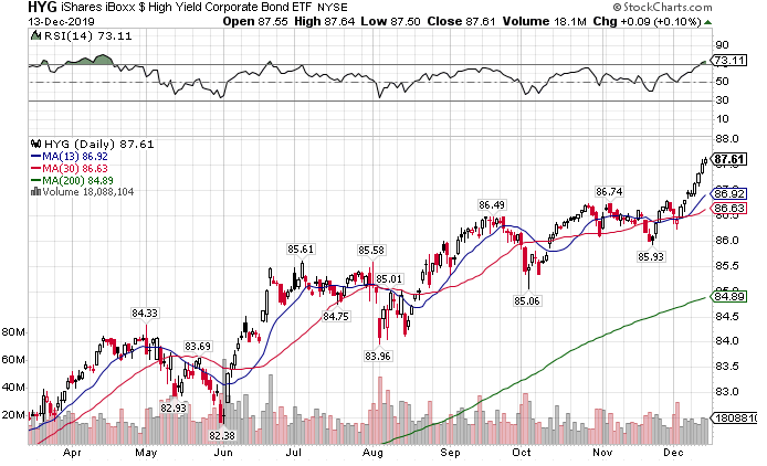
HYG daily chart
This is what happens when you marginalize free market risk. People toss money into bad companies just to get a few extra basis points. It led to the last global recession and will cause the next one.
But that’s ok…
I honestly don’t care what the market brings. My plans rely on battle-tested strategies, not some green private to lead my Total Alpha army.
It’s your decision which general you follow.
